

All DTC Wellness Brands are the Same. Here's the Science.

Every time I peruse Instagram, I see photos of classmates traveling, artists releasing new content, and old friends sharing life updates, but intertwined between those images is a flurry of DTC vitamin subscriptions, hair care boxes, personalized skincare brands—all convincing me to adopt a new lifestyle of health, elegance, and beauty.
Although I'm fast to advocate against Instagram life and beauty standards, I can't help myself but click into each of these DTC brands, hoping to discover a novel product that will change the way I live. I'm convinced that there's something scientific, something uniform about all of these consumer brands that make people readily imagine a new invigorated, beautiful lifestyle for themselves. After doing a deep dive into the similarities across nine DTC wellness brands, I've discovered three concepts that anyone can use to create the next feel-good DTC brand.
The Color and Type
Neutral Pastels
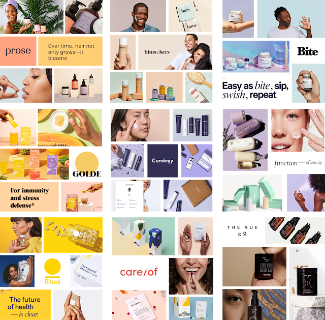
Golde, Hims and Hers, Care Of, and more use neutral pastels in their branding
Looking across DTC product images and landing pages, you see a lot of the same neutral pink, purple, and blue pastel colors. I hypothesize that DTC brands use these neutrals to help viewers feel a sense of calm and ease. The combination of neutral tones and pastel colors is easy for the eyes to adjust to similar to how brands want the viewers easily adopt their products into their daily routines. The neutral pastel also creates a matte-looking background that allows the brand's products to stand out without being too colorful and distracting. Hims and Hers and Prose are great examples of DTC brands who take advantage of the neutral pastel background to spotlight their vitamins, skin care, and hair products.
The Off Black Type

Ritual, Golde, Bite Toothpaste, and Curology using off black type on their websites
A lot of DTC brands seem to use a variant of black that leans purple or blue for their packaging and website type. Curology and Ritual are both brands that use the dark purple font for both headline and paragraph text as opposed to a standard black. Bite Toothpaste uses a dark navy blue for its website descriptions while its logo uses a more pure black. Other companies like Golde use a redder black to contrast brighter pinks, greens, and yellow backgrounds. Similar to the neutral pastels, I find that the off-black feels less intense especially when paired with the neutral backgrounds, both of which help create the wellness ideals that many people want to embrace in their own lives.
Heavy Weights

Hims and Hers, Golde, Care Of, and more use heavy weights for their logos
Although there's no consensus on sans serif versus serif logo fonts, there seems to be more support for logos with heavy weights meaning the type has thicker lines. This makes a lot of sense—heavier weights stand out and are easier to read from afar. Golde, Ritual, Hims and Hers, and The Nue Co are great examples of DTC logos with heavily weighted fonts.
People are Everything
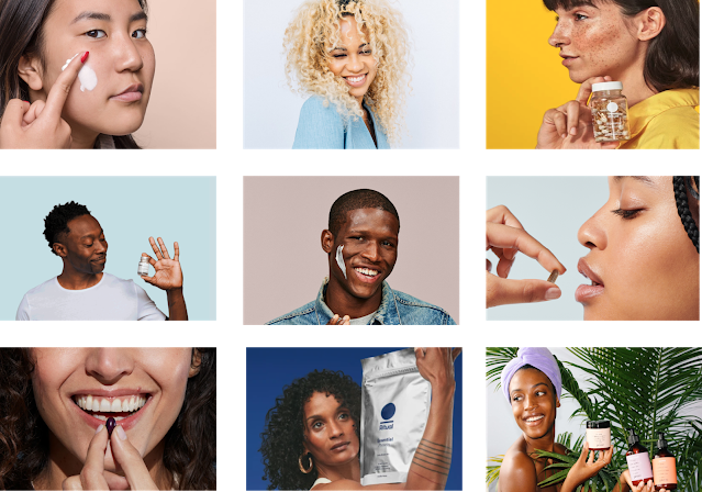
Curology, Function of Beauty, Ritual, and more using diverse faces for their products
Hands and faces. Both are inseparable from any DTC brand. Of course there are lots of pictures of happy people using the DTC products but a lot of brands even go one step further to simply put smiling people across their landing pages to emphasize the feel-good vibe that a recurring wellness subscription could induce in your life.
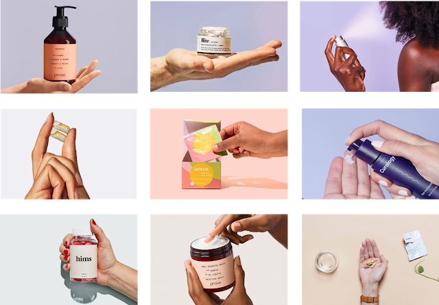
Prose, Bite Toothpaste, Ritual, and more using hands with different skin tones
Moreover, I love that brands are thinking critically about representation. Across different website sections, you can find images of people with different skin colors and ethnicities. For Hims is a particularly interesting DTC company being one of the only all-encompassing wellness brands directed toward men. It makes sense—If you can see yourself using the product, you will likely use the product.
The Personalization Quiz
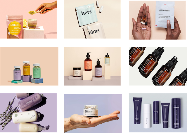
The last integral piece to the DTC brand is the personalization quiz. This past fall, I worked at a startup that tested various landing pages including one with a quiz that gave users personalized suggestions, another with a waitlist, and a third featuring celebrities. Guess what? The personalized quizzed beat the other two in click-through rate. DTC brands from Prose with custom shampoo and conditioner to Care Of with personalized vitamin packs use quizzes to make users feel important as if there is a new brand that is fit for them.
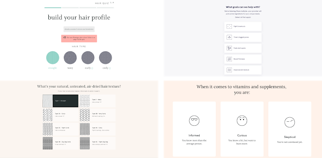
Hair, skin, and vitamin personalized quizzes from Prose, Curology, Care Of etc.
Furthermore, the quizzes spark individuals' curiosities to learn more about themselves. By the time people finish the quiz, they may feel a stronger inclination to subscribe to the brand because they have invested time in the company and already gained knowledge by learning what products fit their needs.
There are many other similarities that make DTC branding so interesting, but also stark differences that do help each brand stand out to different groups of people. I had a lot of fun putting these collages together, and I hope you found something insightful from my analysis of DTC branding!
See you in the next one,
Jane Zhang